- Brand Positioning
- Brand Architecture
- Brand Identity
- Packaging
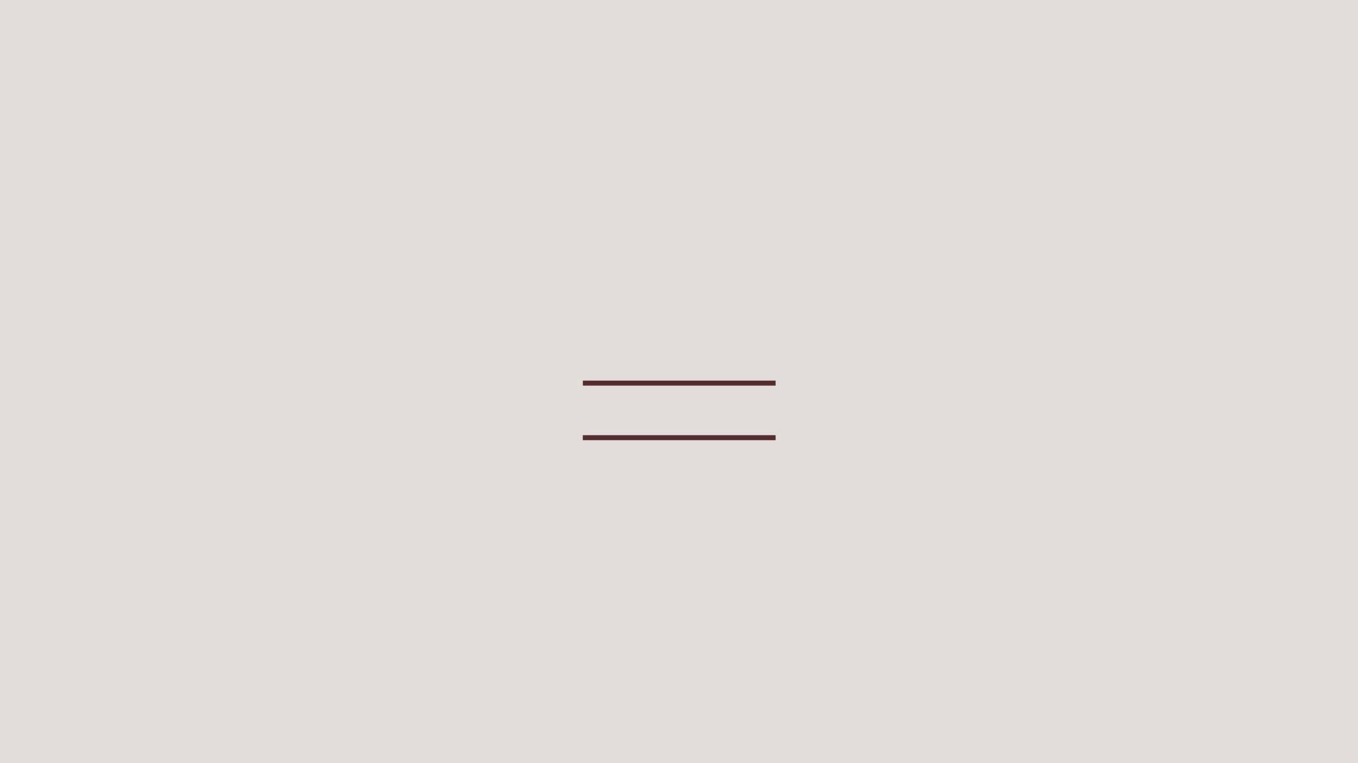
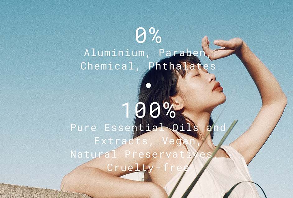
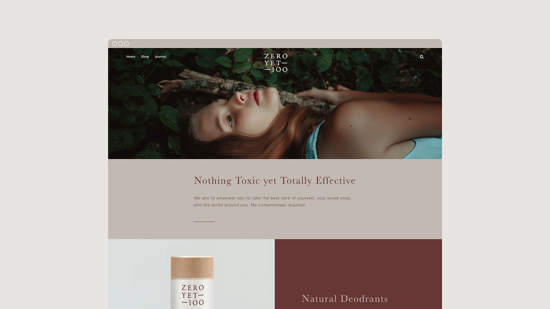
ZeroYet100 is founded on the principle that natural is better. Its products are formulated with ingredients derived from nature with potent, innate properties. ZeroYet100 is more than a product – it's a lifestyle choice. A choice to be free of synthetic and harmful chemicals while embracing the opportunity to cultivate a healthy, self-loving relationship with your body.
On being commissioned to help the business create its brand, we identified a remarkable truth: There is nothing more beautiful than nature itself. By developing solid brand architecture and clear variant differentiation, we set forth to win the trust of consumers without losing out on the emotion behind the product.
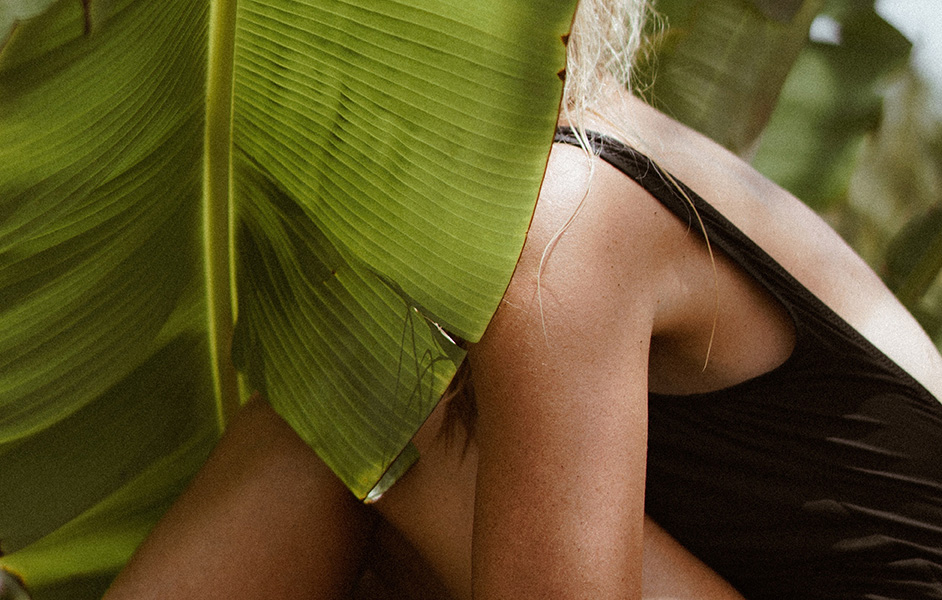
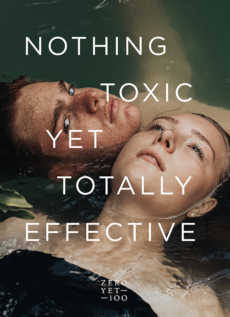
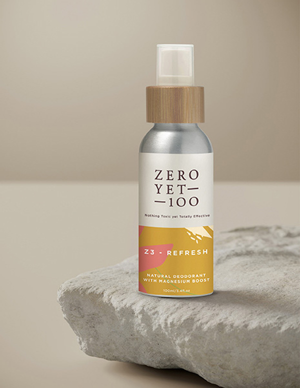
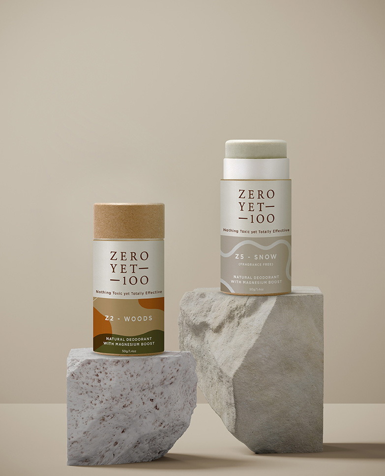
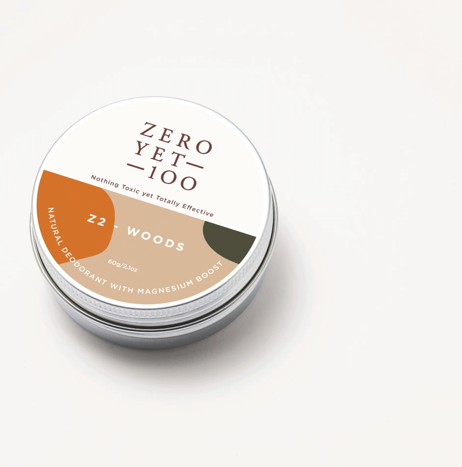
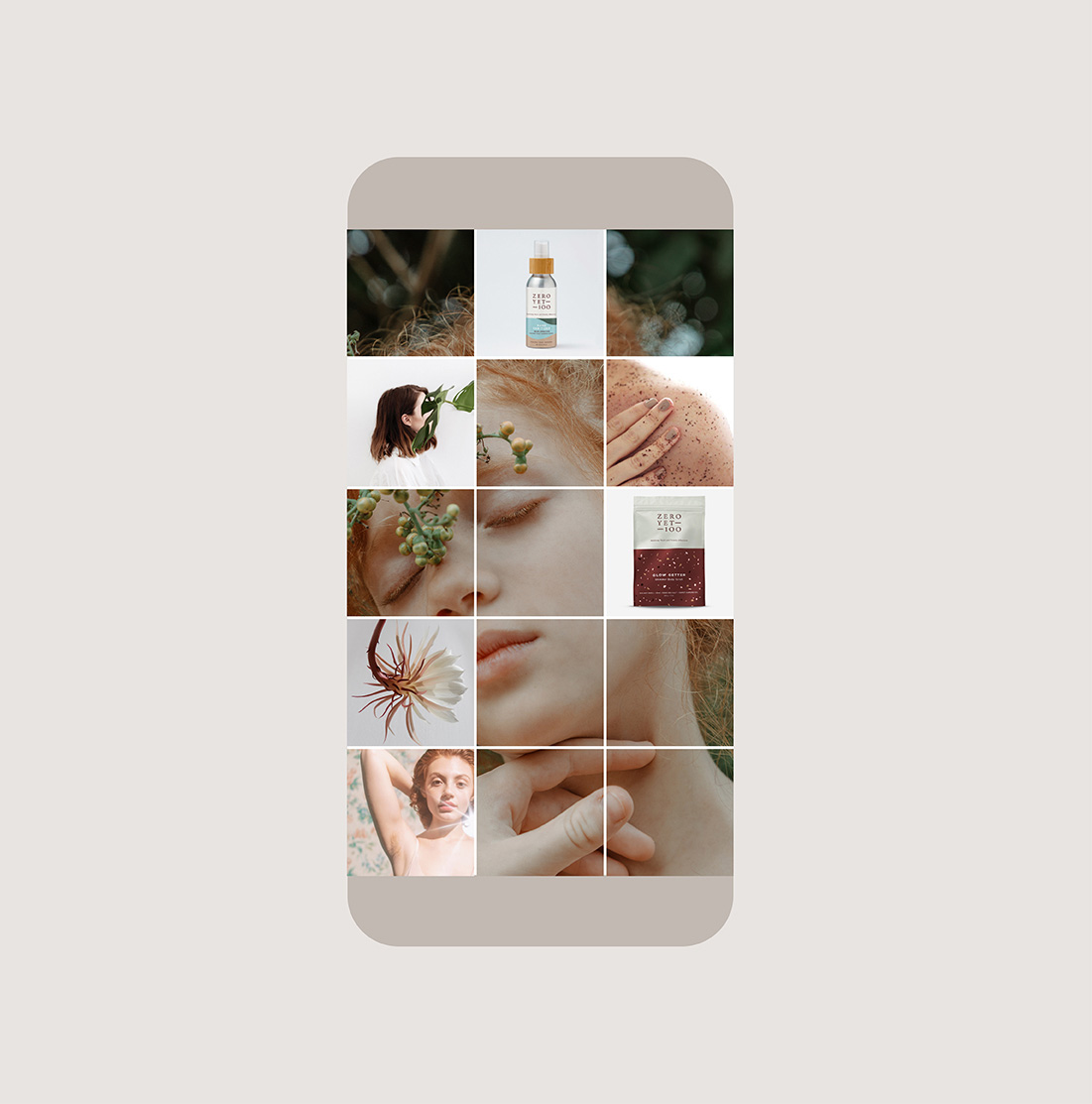
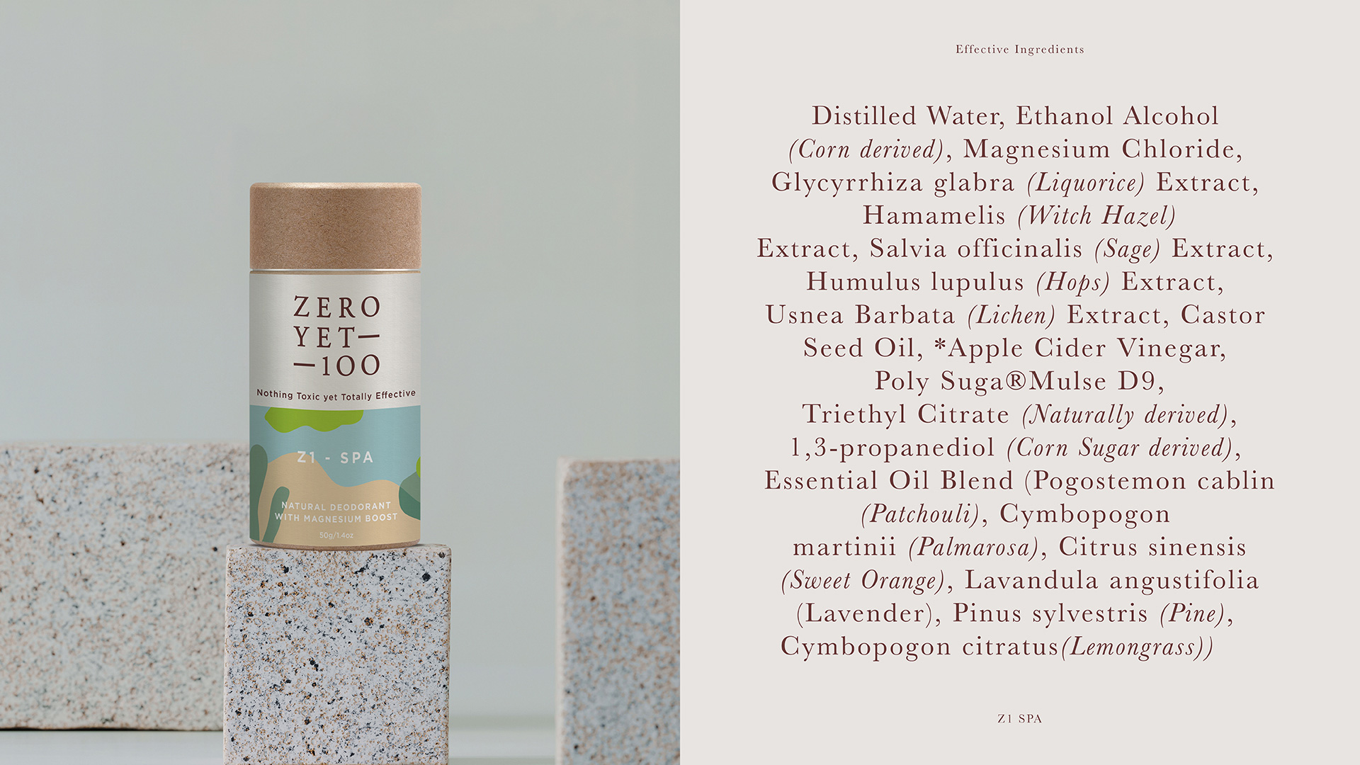
In our work with ZeroYet100, aesthetics are key. By developing a solid architecture, a clear variant differentiation and creating high visual recall value, we wanted to win trust without losing out on emotion. The soft and earthy colour palette is inspired from nature and is used to differentiate between the variants according to its properties. A visual device that binds the brand and its values together is an equal sign that signifies the brand philosophy, zero toxins yet equally effective. As per this device (=) the pack is always divided into half with the top half reserved for the branding and the bottom half for variants.
The soft and earthy colour Palette is inspired from nature and is used to differentiate between the variants according to its properties.
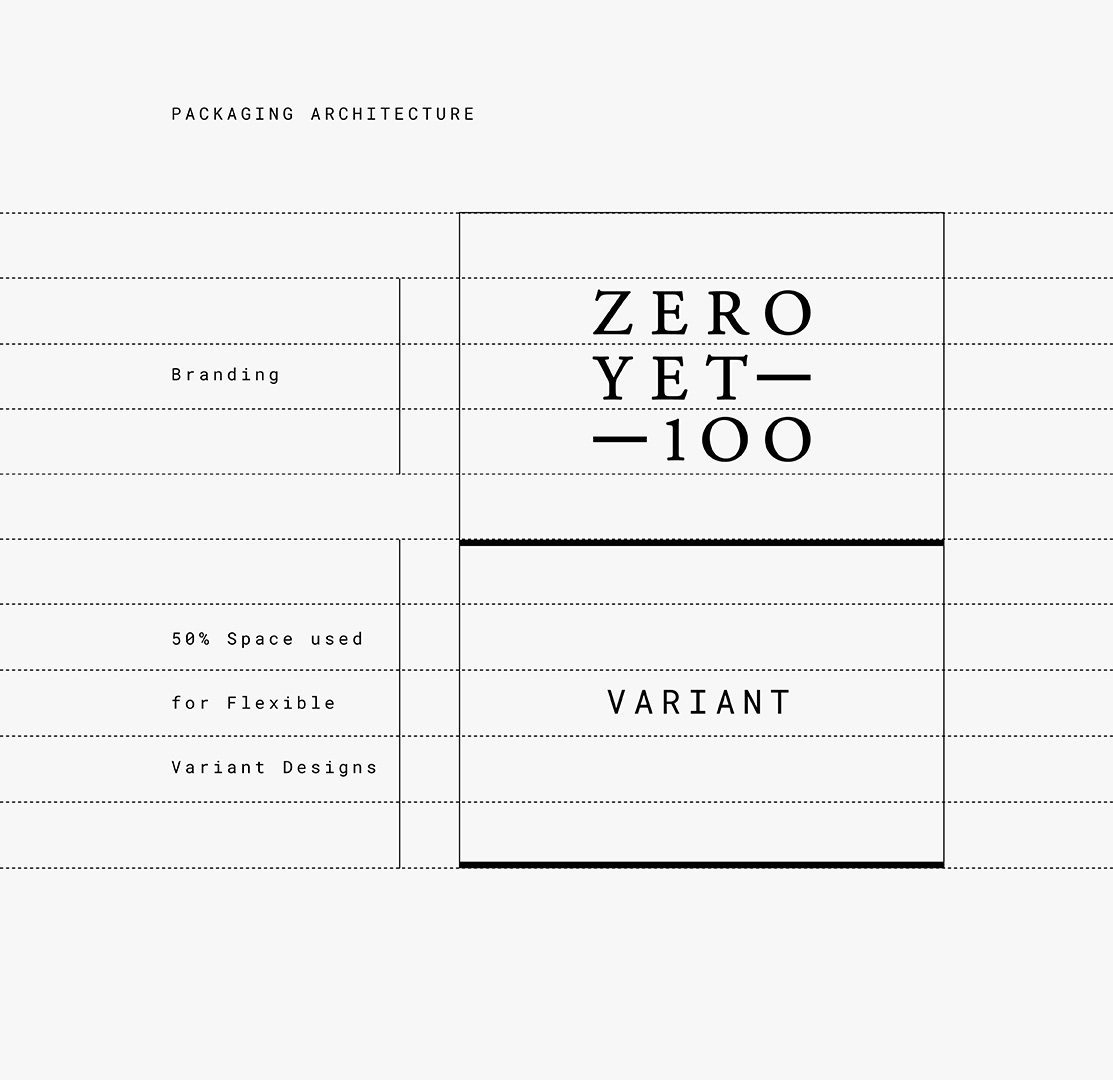
A visual device that binds the brand and its values together is an equal to sign that signifies the Brand Philosophy, zero toxins yet equally effective.
As per this device (=) The Pack is always divided into half with the top half reserved for the Branding and the bottom half for Variants.
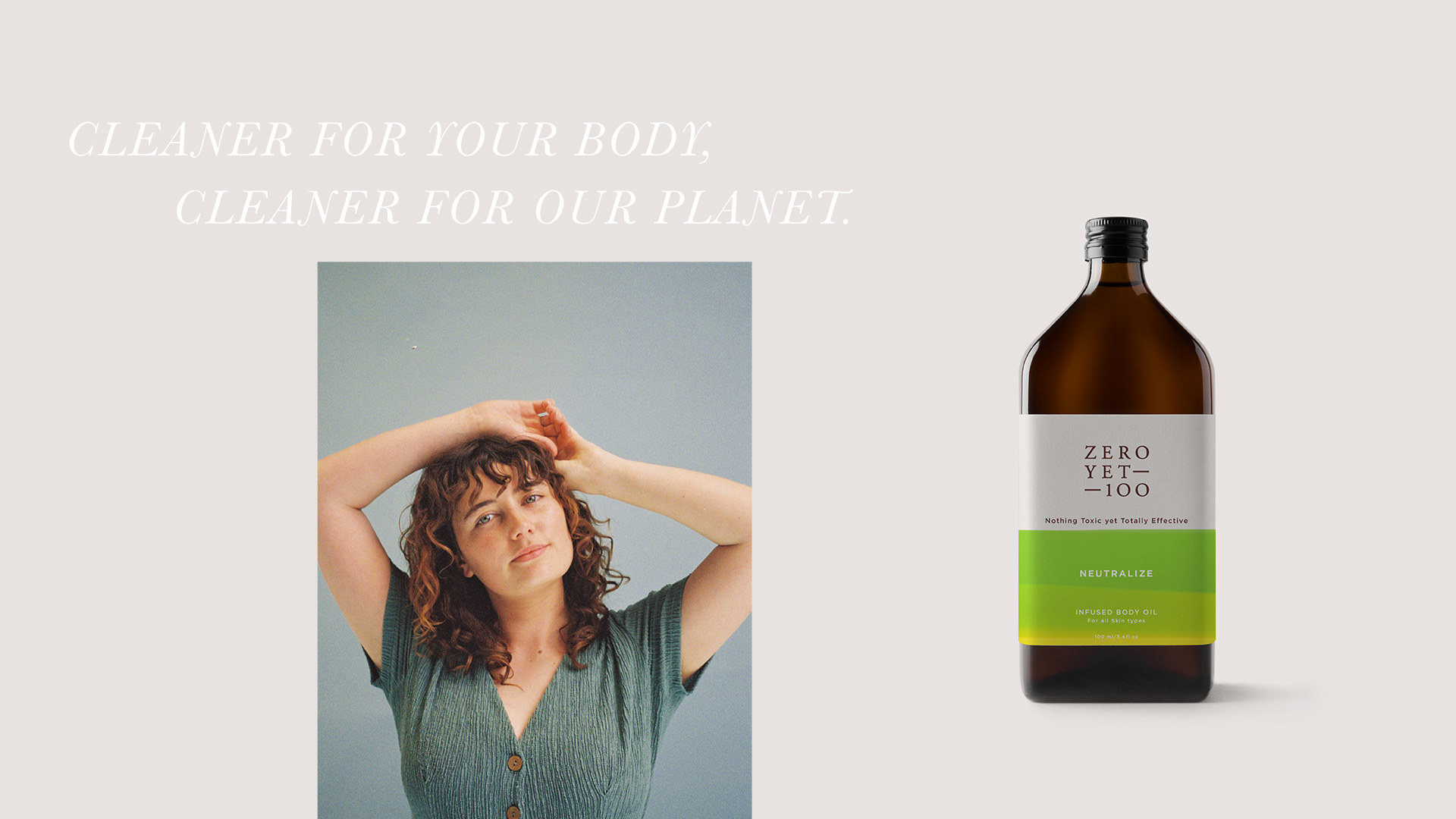

All our efforts while creating the identity for ZeroYet100 were directed towards the single-minded thought, avoid everything artificial, do justice to all things natural, just like the brand. The result is a visual asset that is inspired by simple purity, communicating its benefits with a sense of warmth while inspiring consumers through the power and beauty of nature.
-
One Two
Illustration

-
Zeroyet100
Brand Positioning, Brand Architecture, Brand Identity, Packaging

-
Elephant
Illustration

-
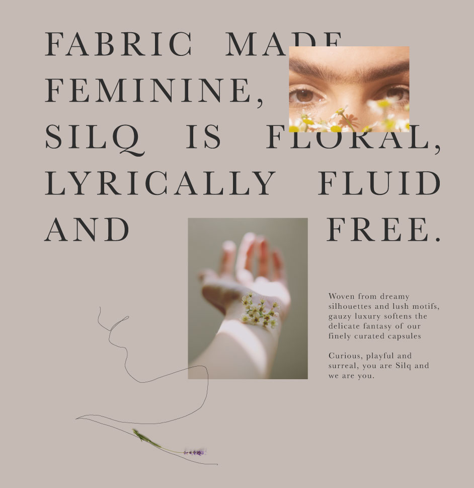
Silq
Brand Positioning, Brand Identity, Packaging, Social Media
-
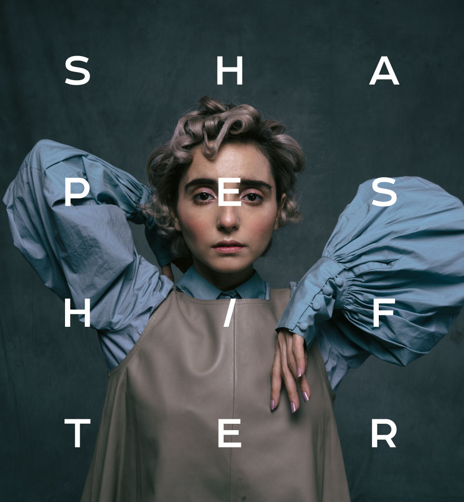
Shapeshifter
Brand Identity, Website Design
-
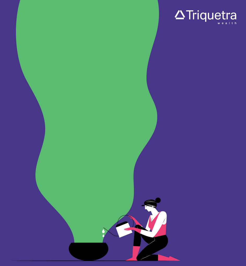
Triquetra
Brand Positioning, Brand Identity, Website Design
-
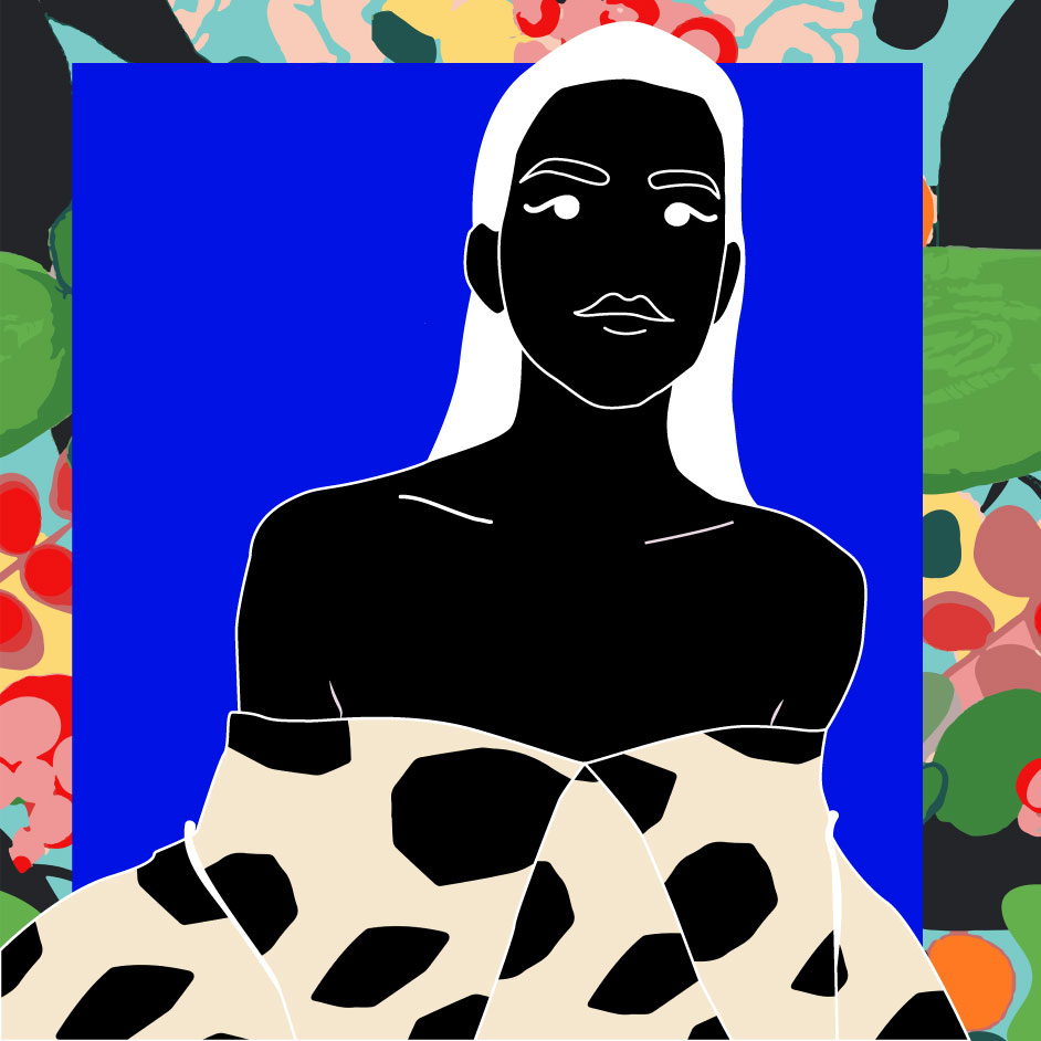
Ellementry
Illustration

-
Urbn
Brand Positioning, Brand Identity, Packaging, Website, Social Media

-
Cricchanakya
Brand Positioning, Brand Identity, Website, Social Media, App Design

-
Papa Don't Preach
Illustration
-
Welfare of Stray Dogs
Illustration
-
The Yellow Grid
Brand Positioning, Brand Identity, Social Media
