- Brand Positioning
- Brand Architecture
- Brand Identity
- Website Design
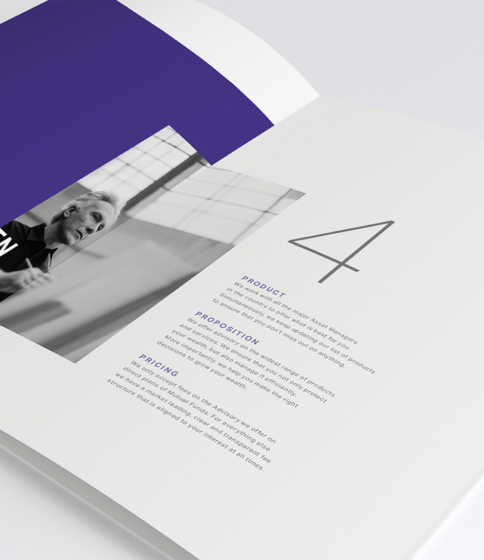
When the company was formed, they aspired to create a platform that was nimble yet evolved, to meet the ever-changing needs of their clients who need specialized advice about private wealth management. They approached us to help create a cohesive visual framework, right from their brand identity to their digital presence.
From the onset, we wanted to avoid conforming to the typical aesthetics that represent financial businesses and develop a solid and serious visual basis. We endeavoured to create a modern and approachable identity for the brand that could easily transition from the digital to the physical seamlessly.
We created the symbol with three pillars converging to a single point, to signify the three components of their core values - Trust, Relationship and Integrity. These three virtues unite to create an upward pointing arrow that symbolizes their commitment to growth and building relationships through trust and integrity.
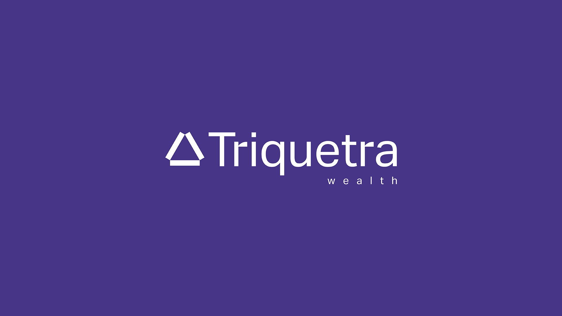


Through simple associations, the new identity reveals the professionalism of the institution to the end consumer. The symbol and the type perfectly complement each other, metaphorically hinting at well - established business processes and practices.
Corporate Identity for the brand is minimalistic, not boring due to colours and non-standard techniques on media, but evokes a sense of a company that can be trustworthy. Triquetra differs from its competitors in its approach to deliver their product and service. The brand colors strike a fine balance between solidity and vitality. They reflect two of the biggest strengths of the brand - consistency and agility. All of this together gave birth to the new promise: 'Onward with every step'
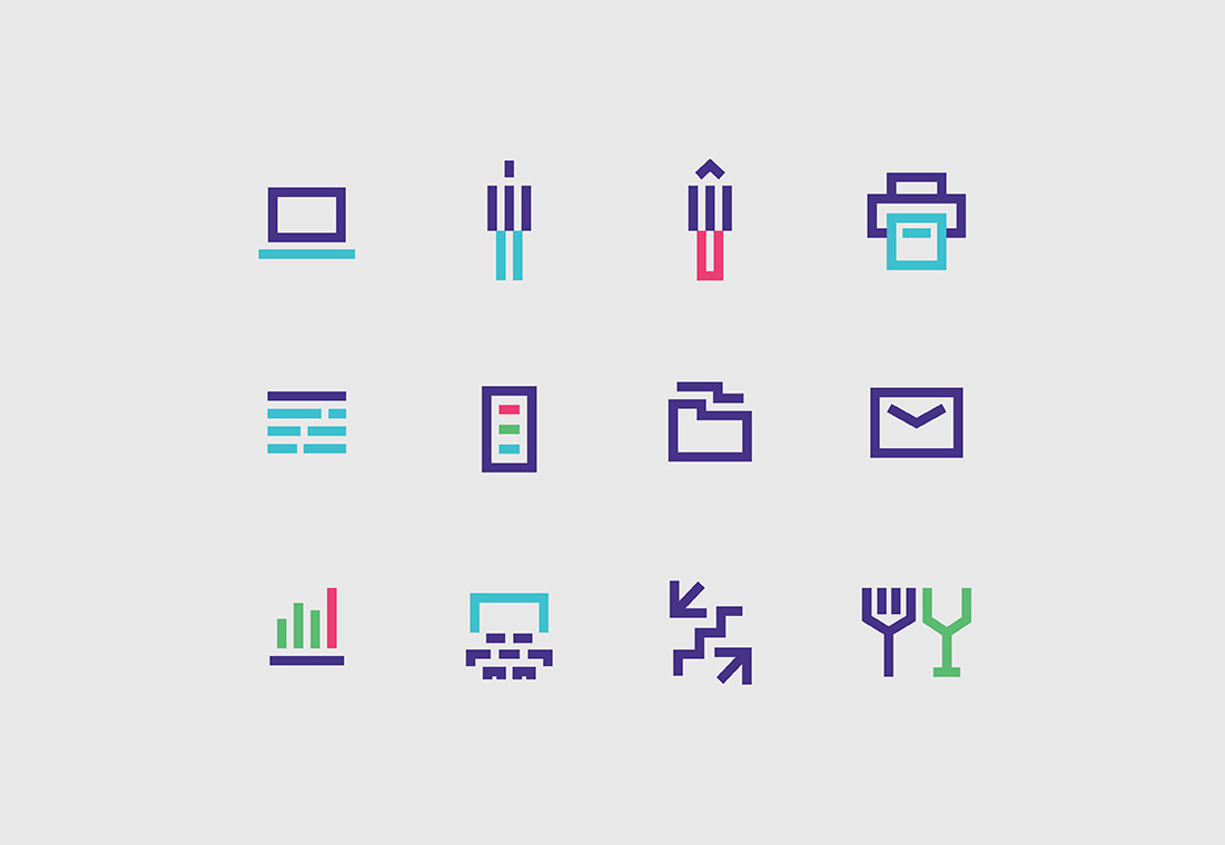
Derived from the geometrics of the brand symbol, the same principles are applied to enhance the brand expression.

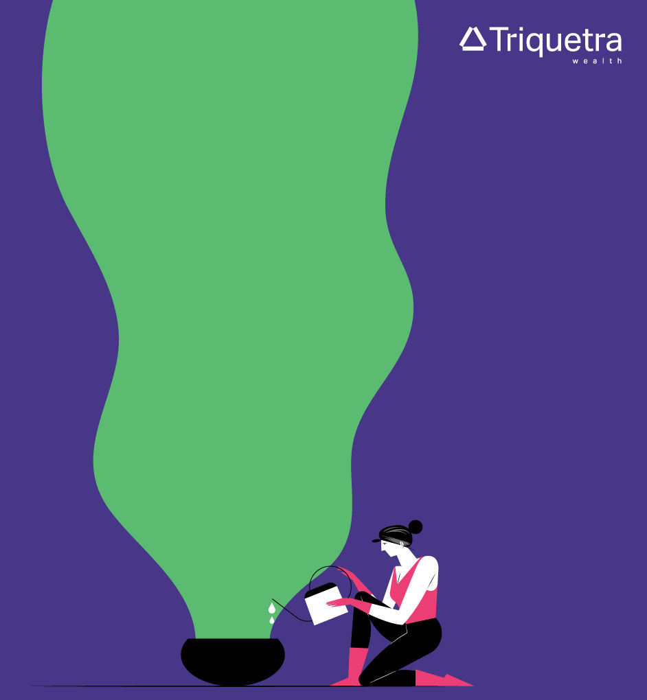
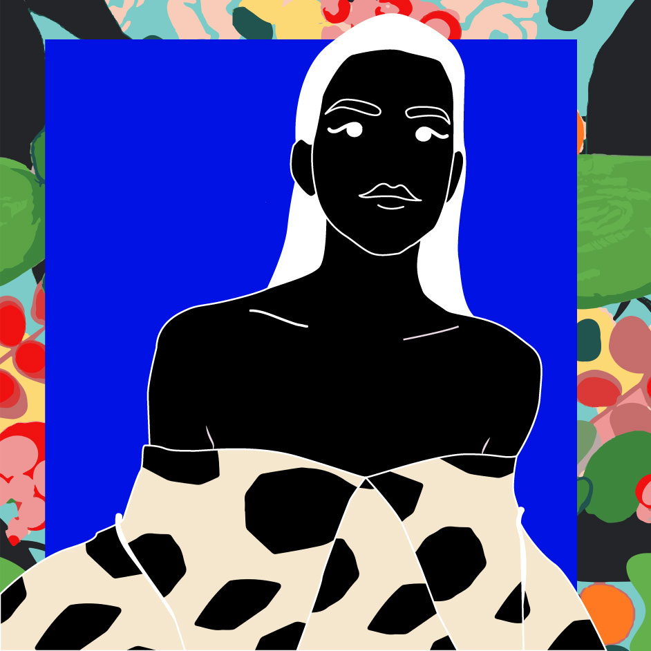
We worked with BunXPav to help develop a unique illustration style to be implemented throughout the bespoke physical collateral and ads. With such a serious, rigid brand, we knew we wanted to bring in an organic element to help create balance and show the human side of the brand. By utilizing the brand palette, the illustrations fit seamlessly into all applications. These illustrations brought a friendly emotional and trustworthy balance throughout the buildout of the brand, physical and digital.

By building upon the simplicity of the brand with modern black and white imagery and the inviting personality of the illustrations, we were able to develop a holistic launch campaign to announce their product. It was important to showcase the brand in a manner that would be familiar and warmly accepted by their clients, thereby, firmly cementing their brand in the market.

-
One Two
Illustration

-
Zeroyet100
Brand Positioning, Brand Architecture, Brand Identity, Packaging

-
Elephant
Illustration

-
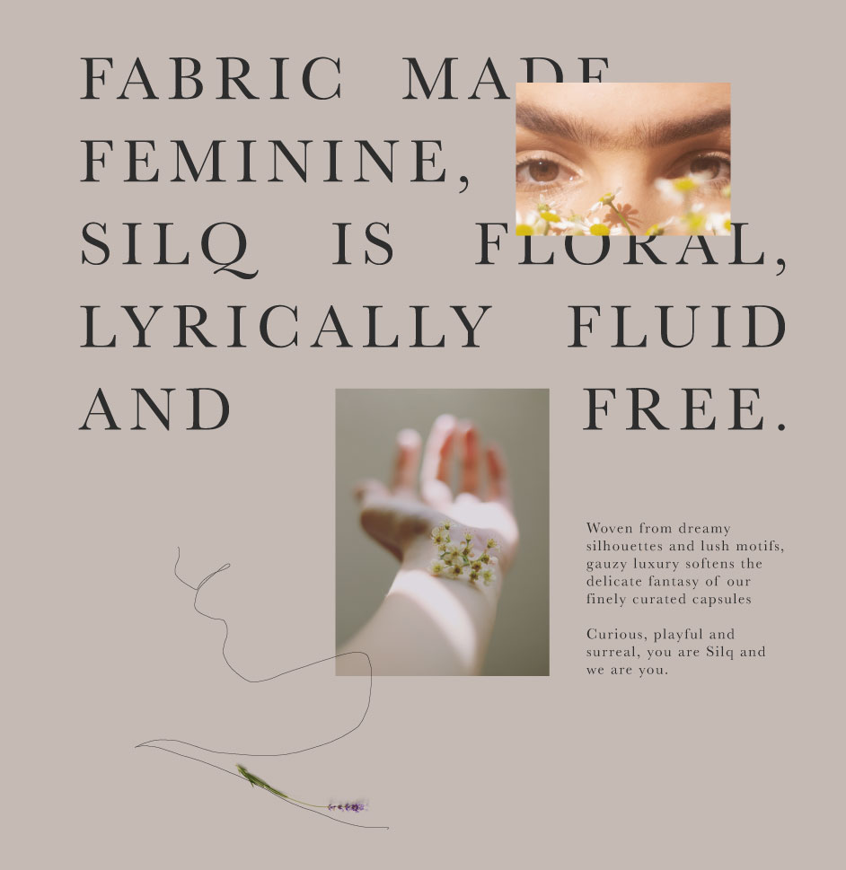
Silq
Brand Positioning, Brand Identity, Packaging, Social Media
-
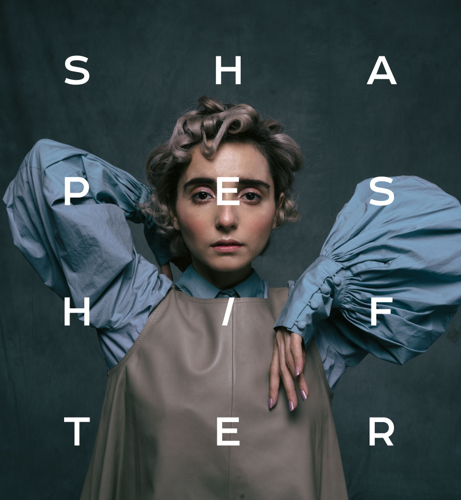
Shapeshifter
Brand Identity, Website Design
-
Triquetra
Brand Positioning, Brand Identity, Website Design
-
Ellementry
Illustration

-
Urbn
Brand Positioning, Brand Identity, Packaging, Website, Social Media

-
Cricchanakya
Brand Positioning, Brand Identity, Website, Social Media, App Design

-
Papa Don't Preach
Illustration
-
Welfare of Stray Dogs
Illustration

-
The Yellow Grid
Brand Positioning, Brand Identity, Social Media
